UX Audit Checklist for Enterprise Apps – What Most Teams Miss
Enterprise applications are complex beasts. More than casual browsing or quick interactions, enterprise apps power payroll systems, manage logistics, and support entire organizations serving hundreds of thousands of clients. Imagine Salesforce, Hubspot CRM, Google Workspace, and Microsoft 365.
Research shows that improving UX in enterprise systems can boost productivity by up to 400%, reduce errors, and significantly cut support costs.
However, traditional UX audits often fall short. Unlike consumer apps, enterprise systems involve intricate workflows, heavy data loads, and multiple user roles.
A strong UX audit focuses on how work actually gets done, i.e., understanding workflows, reducing friction, improving system feedback, and aligning the interface with real user behavior instead of just improving visual design.
A truly effective enterprise UX audit goes beyond surface-level design. It focuses on real workflows, friction points, system feedback, and how users actually work; delivering measurable improvements in efficiency, accuracy, and adoption.
These are the deeper aspects teams must evaluate to uncover real usability gaps. Let’s break them down using a practical checklist.
Breaking Down Enterprise UX Complexity
Enterprise apps are built for crucial tasks with each interaction carrying out a complex set of work, involving;
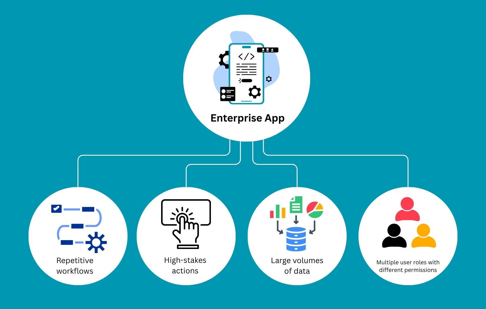
A proper UX audit identifies, from the users’ perspective, where the system falls short or slows users down, even when everything seems to be working fine from the development team’s side.
UX Audit Checklist for Enterprise Apps
Let’s take a look at how a UX audit may be more than necessary for enterprise app dev teams. Here is a structured checklist to effectively evaluate your enterprise application.
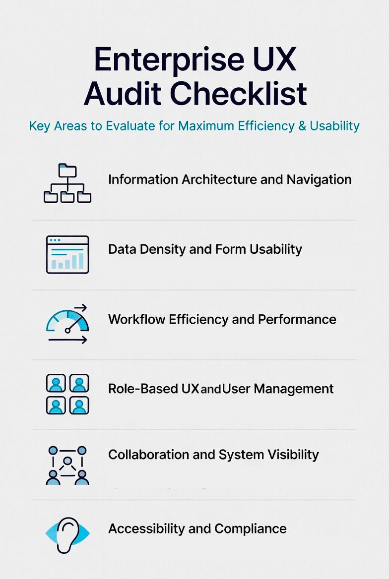
1. Information Architecture and Navigation
In many enterprise apps, navigation evolves organically, meaning new features get added wherever space is available.
But piling on too many features may create cluttered menus and deep hierarchies that make simple tasks harder than they should be.
Take a step back and understand how users find things, not just how things are arranged. For instance, a support agent shouldn’t click through five layers to update a ticket. It should be placed as primary navigation within the first screen or dashboard. Navigation should feel predictable and almost invisible.
For that, you can use methods like:
- User journey mapping: Highlighting how users would navigate from top to bottom
- Tree testing: Most important links come first
- Heatmaps and click tracking: Testing users’ real-time activity to track where they hover or click more.
Auditing this helps users reach key features faster without confusion or hesitation. Here is how most successful enterprise apps with complex navigation often solve these issues.
|
Navigation Type |
Purpose |
What It Should Contain |
Best Practices |
|
Primary Navigation |
Main access to core modules |
High-level sections (Dashboard, Customers, Orders, Reports, Settings, etc.) |
Limited to 5–7 top items, always visible |
|
Secondary Navigation |
Context-specific tools & features |
Sub-menus or tabs related to the current primary section (e.g., All Leads, My Leads, Lead Settings) |
Changes based on the selected primary item |
|
Breadcrumb Navigation |
Shows current location & quick backtracking |
Full path (Home → Customers → John Doe → Edit Profile) |
Always show the full hierarchy, clickable |
Key Checklist Questions:
- Navigational Depth: Are important actions reachable within a few clicks?
- Search Functionality: Is search strong enough to replace navigation in some cases?
- Contextual Navigation: Does navigation change based on the user's actions?
- Information Density: Is secondary information hidden until needed (progressive disclosure)?
2. Data Density and Form Usability
Imagine a trader scanning a table with hundreds of rows to pick a company to invest in. If they can’t filter quickly or spot key information at a glance, the system slows them down, even if everything is technically correct. Or consider a long form: if validation occurs only after submission, users feel punished for mistakes rather than guided.
Dealing with data density and form usability focuses on reducing cognitive load, handling large datasets quickly with fewer errors, and improving clarity.
You can implement methods such as session recordings, usability testing, and form analytics to conduct UX audits.
Here is the list of key questions to ask when auditing data density and form usability.
|
Checklist Item |
Key Question |
Why It Matters |
|
Data Table Usability |
Are tables easy to scan, sort, filter, and customize (columns, layouts, views)? |
Reduces cognitive load and helps users find critical information quickly |
|
Bulk Processing |
Are bulk actions (edit, delete, approve, export, etc.) easily available? |
Saves significant time on repetitive tasks |
|
Form Validation |
Is validation provided in real-time with clear guidance, rather than only after submission? |
Prevents user frustration and reduces errors |
|
Undo/Redo Capability |
Can users easily undo or correct their actions? |
Builds confidence and reduces fear of making mistakes |
3. Workflow Efficiency and Performance
This is where most enterprise UX problems hide, not in design, but in flow.
Did you know that fixing UX issues post-launch can cost 3 to 5 times more than incorporating design early? The cost of delaying design is ultimately higher due to the need for major retrofitting.
A task that should take 30 seconds might take 2 minutes due to extra steps, repeated input, or slow system responses, and not everyone is patient enough to wait it out!
For example, if a user performs a task 100 times a day, even a 5-second delay becomes significant. Multiply that across teams, and it adds up to hours of lost productivity.
Analyze how long it actually takes to complete core tasks, and why. Identifying friction in real workflows reduces task time and enables smooth, faster workflows.
Key Checklist Questions:
- Time-on-task: How many steps are required to complete key tasks?
- Autofill and Templates: Are repetitive data-entry tasks reduced by autofill or templates?
- Shortcut Support: Are there shortcuts or automation for frequent users?
- System Feedback: Does the system provide feedback during long-running batch processes and when delays occur?
4. Role-Based UX and User Management
Focusing on this part makes permissions more visible and meaningful.
Enterprise apps rarely cater to a single user type. Admins, managers, and employees each interact with the system differently, yet the interface often fails to clearly reflect those differences.
If a user logs in and sees options they don’t understand, options they can’t use, disabled buttons, and features hidden without context. It creates confusion and delays decision-making.
Users must clearly understand what they can do without confusion.
Key Checklist Questions:
- Role-Based Access Control UX: Does the interface adapt based on user roles?
- Delegation: Are permissions clearly communicated?
- Clarity: Are unnecessary features removed - or just hidden?
5. Collaboration and System Visibility
Because work in enterprise environments is rarely done individually, integrating collaboration into the product greatly improves workflow efficiency.
Most of the time, tasks are passed between people, decisions require context, and changes need to be tracked.
If actions such as assigning a task, leaving a note, or updating a record require external tools or manual tracking, the system introduces friction.
Thus, evaluate how well the system supports teamwork and transparency. You can interview stakeholders and analyze the workflow to refine visibility and team collaboration.
Key Checklist Questions:
- Collaboration Features: Can users assign, share, or comment within workflows?
- Workflow: Can teams easily follow what’s happening?
- Audit Trails: Are feature alterations tracked and easily visible?
6. Accessibility and Compliance
Accessibility is often treated as a checkbox by designers. But in reality, it improves usability for all users.
Text that’s hard to read, buttons that can’t be accessed via keyboard, or charts that lack context all create barriers. There are many accessibility testing and screen reader testing tools for analyzing and improving accessible features.
Moreover, in the U.S., compliance with WCAG standards is becoming increasingly important, especially for enterprise tools.
If your users are legal or international parties, you must implement compliance measures tailored to their location or profession. Overall, the design must be inclusive and work for all users, so that it is highly accessible and compliant.
Key Checklist Questions:
- WCAG 2.1/2.2 Compliance: Is the app legally, ethically, and geographically compliant?
- Keyboard Navigation: Can users navigate without a mouse?
- Accessibility of Complex Visuals: Are charts and visuals accessible through text alternatives or data tables?
What Most Teams Miss in UX Audits
Even well-built enterprise apps overlook small but critical details. Ignoring this slows down daily operations.
Here are the most common gaps:
|
Area |
Common Problem |
Recommended Solution |
|
Useful Empty States |
Blank screens with no guidance confuse users |
Provide clear explanations and actionable next steps |
|
Terminology Consistency |
Different terms are used for the same concept |
Maintain consistent language across the entire system |
|
Clear Error Messages |
Generic or unhelpful error messages |
Use specific, actionable messages that guide users to fix the issue |
|
Support for Power Users |
Systems designed only for beginners |
Add shortcuts, bulk actions, saved filters, and advanced options |
|
Contextual Help |
Help content is hidden or separated from workflows |
Offer inline tooltips, hints, and guidance within the flow |
Conclusion
Enterprise UX isn’t about making things look better. It’s about making work easier.
When teams focus on auditing small issues, hidden gaps, and workflows, only then does productivity improve, errors decrease, and real business value drive.
If you are looking to audit UX for better enterprise outcomes or develop a large-scale SaaS, contact Searchable Design, an offshore team with expertise.
Related Post
RECOMMENDED POSTS


RECOMMENDED TOPICS
TAGS
- artificial intelligence
- agentic ai
- ai
- deepseek
- machine learning
- llm
- data science
- saas
- ai/ml
- growth engineering
- chatgpt
- gpt
- openai
- ai development
- cloud management
- cloud storage
- customer expectation
- cloud optimization
- aws
- sales growth
- gcp
- social media
- social media marketing
- social influencers
- api
- application
- cybersecurity
- software engineering
- scalable architecture
- mobile development
- modular saas
- api based architecture
- deep learning
- python
- user experience
- app development
- user interface
- data analysis
- data pipeline
- generative ai
- deepfake
- healthcare
- climate change
- llm models
- leadership
- it development
- empathy
- static data
- dynamic data
- ai model
- open source
- xai
- qwenlm
- bpa
- automation
- database optimize
- modern medicine
- growth hacks
- data roles
- data analyst
- data scientist
- data engineer
- data visualization
- productivity
- database management
- sql query
- data isolation
- db expert
- artificial intelligene
- test
ABOUT
Stay ahead in the world of technology with Iowa4Tech.com! Explore the latest trends in AI, software development, cybersecurity, and emerging tech, along with expert insights and industry updates.
Comments(0)
Leave a Reply
Your email address will not be published. Required fields are marked *